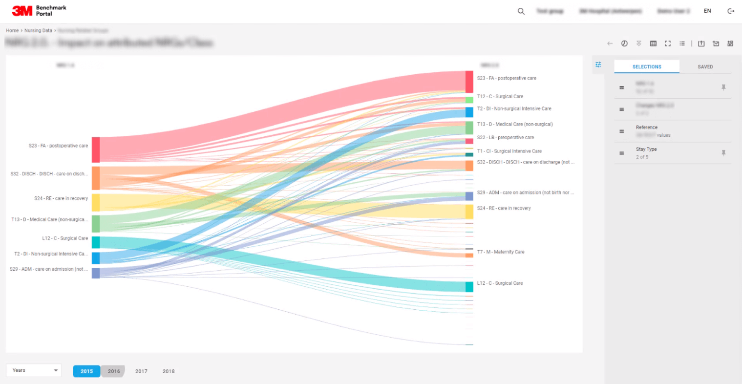
Pic. 4. Sankey Diagram
A Sankey diagram is a specific type of visualization used to display the flow of one set of values to another. This kind of diagram is often used to demonstrate business processes or dataflow. A Sankey diagram shows workload, capacity, efficiency, as well as correlations, their power and contribution to the common flow. The lines in the diagram can overlap or diverge. The width of a line depends on the ratio in the flow, with the line thickening as the parametre increases. The diagram is also often used to demonstrate the ratio of budget costs and budget revenue. In our example the diagram shows two models of hospital financing: the old model is on the left, the new variant is on the right. It helps analyse the changes in the structure of financing after assuming the new model’s set of rules.
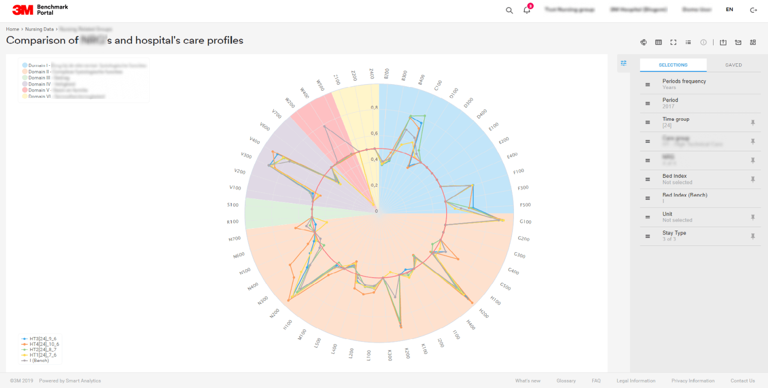
Pic. 5. Radar Chart
A radar chart, also known as a spider diagram, comes in handy for collating quantitative variables. It is possible to easily compare several indicators at the same time and see if there are any serious digressions that may require further research. In our example the radar chart demonstrates healthcare care profiles in a hospital. It shows the frequency of treatments in one and the same department – e.g. in intensive care. The higher the frequency of treatments, the more costs would need to be allocated for this or that treatment.
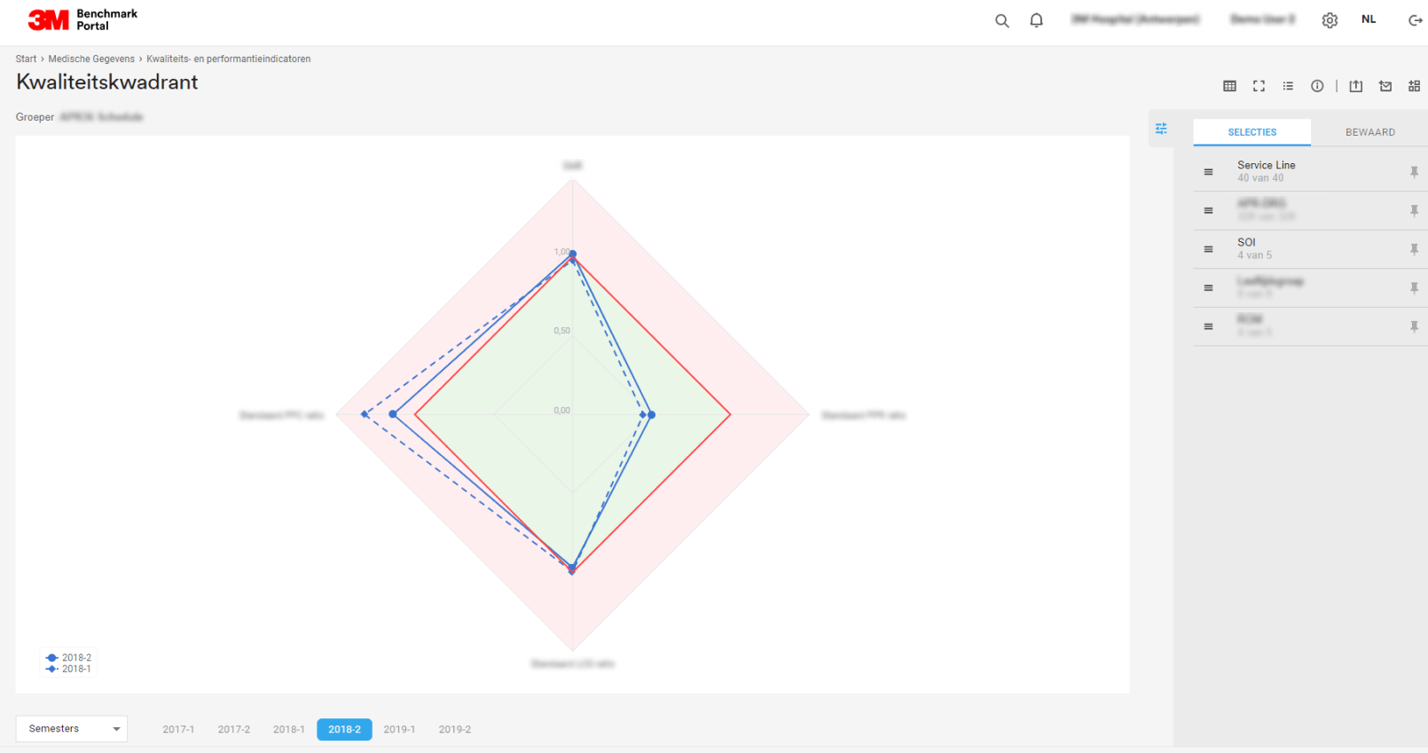
Pic. 6. Spider Chart
Another analytical report with the use of a spider diagram can be seen in the next example. This example demonstrates the generalized situation at the hospital at the key points of the quality of treatment: repeated admissions of patients, medical complications, mortality rate and average duration of stay in hospital. The red line shows the average indicators, the dark-blue line shows the current situation and the dotted line demonstrates the situation in the last quarter.
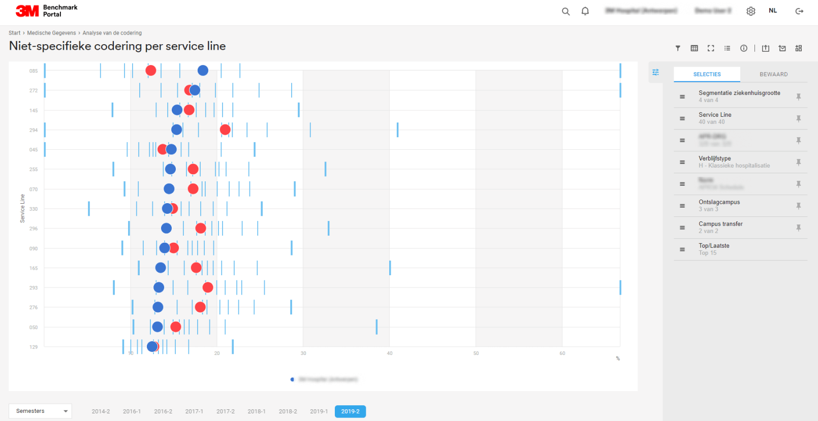
Pic. 7. Scatter Plot
A scatter plot, or a scattering diagram, is one of the seven key graphical methods most suitable for handling quality issues. It looks like a graph with values marked on the X axis and Z axis where every pair of values can be represented by a dot. The accuracy of the model may be judged by how scattered the dots are on a given graph. If most dots accumulate along a line and digressions are negligible, the model works well. On the other hand, the accuracy of the model is not so good if the dots are widely scattered.
Every line is a separate scatter diagram in the screenshot. This analytical report reveals the level of coding errors in certain categories of treatment in a hospital, with every category involving treatment for a certain group of medical conditions. The report also shows the quality of coding in hospitals. The red circles are average values while the blue ones show the situation in this or that hospital.
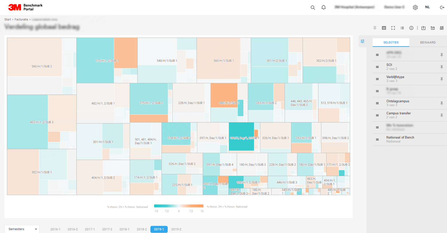
Pic. 8. Heatmap
A heat map serves to show a large volume of comparison data where values are displayed as marked coloured tiles. Heat maps are convenient when it comes to showing variations with a number of variables, detecting patterns, revealing similarities between variables and uncovering any dependencies among them.
A heat map is ideal for comparing the efficiency of a company’s divisions, as well as for detecting priorities for investments or areas for improvement. In our example the map shows the prevalence of patients’ diagnoses for groups of medical conditions.
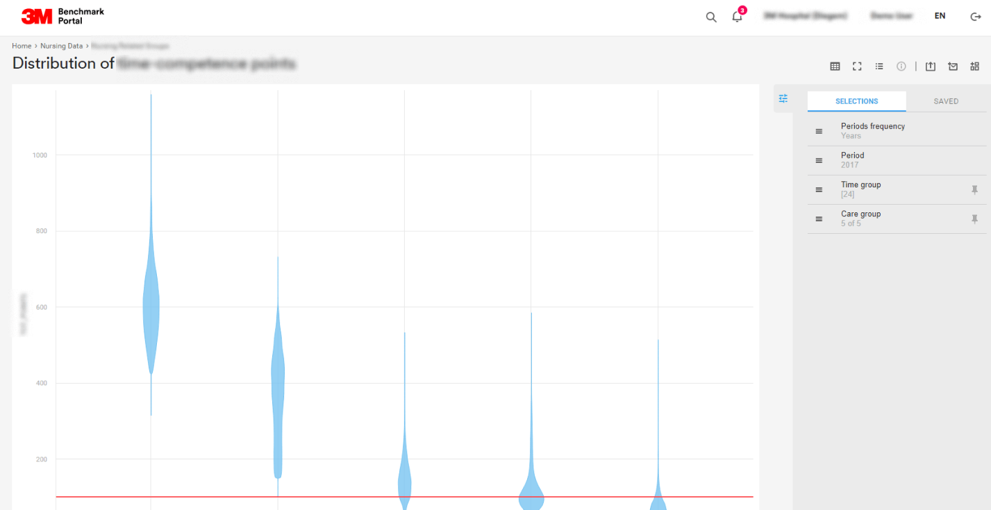
Pic. 9. Violin Plot
The last type is a violin plot. This statistical diagram is used to visualize the division of data and their frequency distribution. Every ‘violin’ represents a group or a variable. Its shape shows the estimated frequency distribution for a variable. The more dots there are in a given range, the more violin expands. Even though the graph may appear peculiar, it often proves to be quite useful, especially when the shape of distribution is called for.
A violin plot is used to show frequency distribution comparison in different categories. It helps the user to decide whether an average value can be used instead of a probability estimate.
In our example every violin is symmetrical from left to right. Although ideally these violins are supposed to be compact with very short tails, in our case the violins are elongated with the median value rather stretched out. This is a signal that the choice of the categories was not ideal.
We heard nothing but good things about our portal.
Users of the Portal
3M Health Information Systems
Data Visualization for Tasks of Any Complexity
Data visualization is a powerful tool for demonstrating the results of business analysis that helps to clearly show to users data and gives recommendations.
With a wide range of options of how to visualize information – from pie charts and bar charts to radar and violin plots – data become clear and visually compelling for the user. The correct choice of visuals for the analytical report may reveal better than anything what the data really contains. It should be taken into account that the data should be clear to all categories of users – analysts, managers and any interested external users.
Solutions for data visualization and dissemination developed by Smart Analytics facilitate working with a wide array of data sources. They allow users of any level, from beginners to advanced data analysts, to analyse data on their own, as well as build interactive reports of any complexity and share information with interested users worldwide.